Case Study
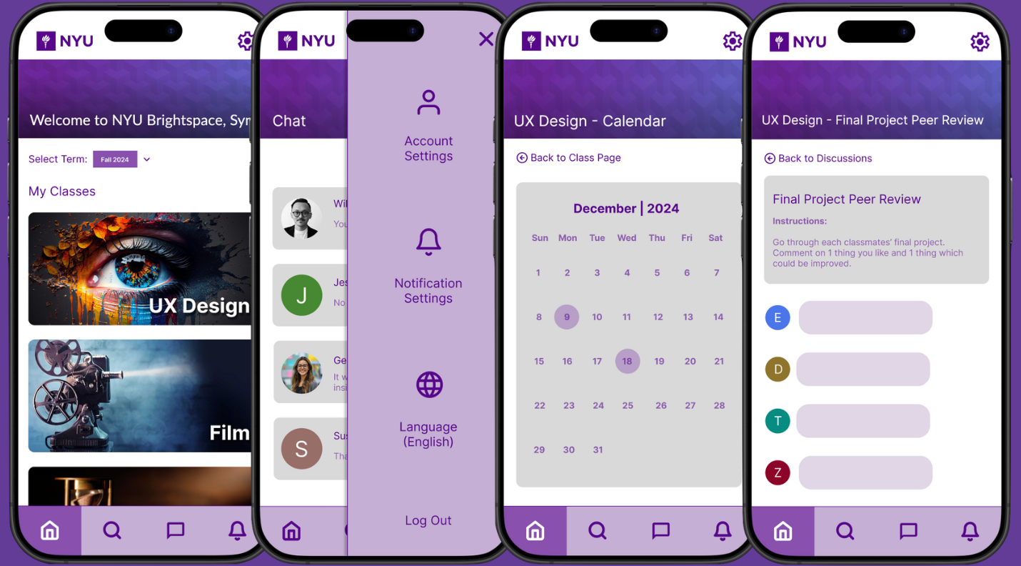
NYU uses an educational platform called Brightspace, which allows students access to all of their classes’ assignments, announcements, and more in one place. While the desktop version of Brightspace is organized, the mobile browser version is not. Eager to solve this issue which thousands of NYU students face on a daily basis, I decided to design my own version of what a user-friendly Brightspace mobile app would look like. My goal was to make it more convenient for students to access Brightspace from anywhere, along with allowing them the additional benefit of receiving direct notifications to their mobile devices rather than getting their emails flooded with notifications.
The following was my research and design plan for this project:
- Conduct research via user surveys to identify plus points and pain points of using Brightspace on mobile browser. Find out what features students would like to see in a mobile app version.
- Send this survey to NYU students who use Brightspace. Analyze the results to understand the needs of students who use Brightspace.
- Consider the key takeaways from the survey results and create a low-fidelity wireframe for a mobile app version of Brightspace with Figma.
- Explain the design to a few students and conduct user interviews to understand the pros and cons of the prototype, from a third perspective.
- Keeping the interviews in mind, adjust the wireframe accordingly. Then, build upon it to create a high-fidelity clickable prototype.
- Finally, conduct usability tests to observe users as they interact with the prototype. Identify usability issues and refine the prototype.

